Design your Ring
Ruffs Reimagined
A family conversation, generations in dialogue, and a return to what has always mattered — craft, restraint, and things made to last.
- By Ruffs
There’s a particular kind of magic that happens when generations lean in together.
At Ruffs, we speak often about slow beauty; about craft shaped not for a moment, but for a lifetime. That belief lives not just in every ring we form by hand, but in the way we became the version of our brand that you see today. What began as a quiet conversation between siblings and parent unfolded into months of re-imagining how Ruffs speaks - not only through its craft, but through its voice.
Our grandfather’s workshop held its own atmosphere - warm with age, marked by time, and shaped by the steady rhythm of making. Brass stamps lay within reach, tools worn smooth by use, and stories passed between generations as naturally as breath. Those memories became our anchor. We wanted to honour that lineage, but also let it breathe - to allow Ruffs in 2026 to feel as alive as the workshop does at seven in the morning, full of quiet purpose and fresh possibility.
My sister approached the process with a designer’s eye - always attuned to nuance, to the moment where a piece of copy might touch the reader as a ring touches a finger. She asked a simple but profound question: What should our voice feel like? The answer was never about being loud or current. It was about resonance. The brand needed to feel like a conversation - personal, considered, and enduring.
We gathered around my father’s old oak table -sketches, drafts, rings, and half-drunk mugs of tea. Some days we spoke about heritage; others about now. Every word was treated with the same patience as a hand-polished band - deliberate, intentional, heartfelt. Nothing rushed. Because this is the point: we shape things to last.
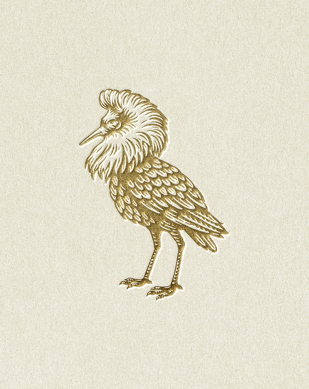
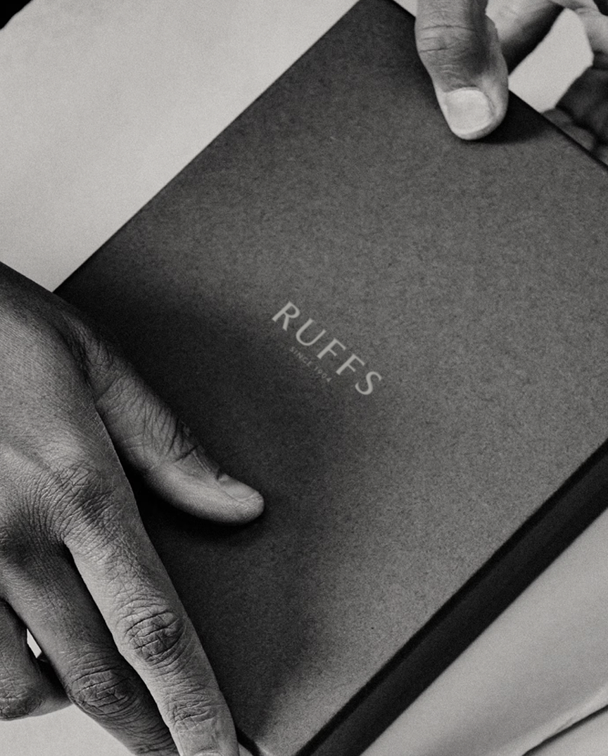
At the heart of that table sat the Ruffbird.
For over 120 years, the Ruffbird has been our mark - a quiet witness to generations of making. But as we looked closely, we realised it deserved the same care and clarity we give our jewellery. We worked with an exceptional illustrator to re-define it — the same hand that once shaped the American Express centurion. Together, we didn’t modernise the Ruffbird; we listened to it. Its posture, its confidence, its restraint. We allowed it to become itself again.
From that moment on, everything followed.
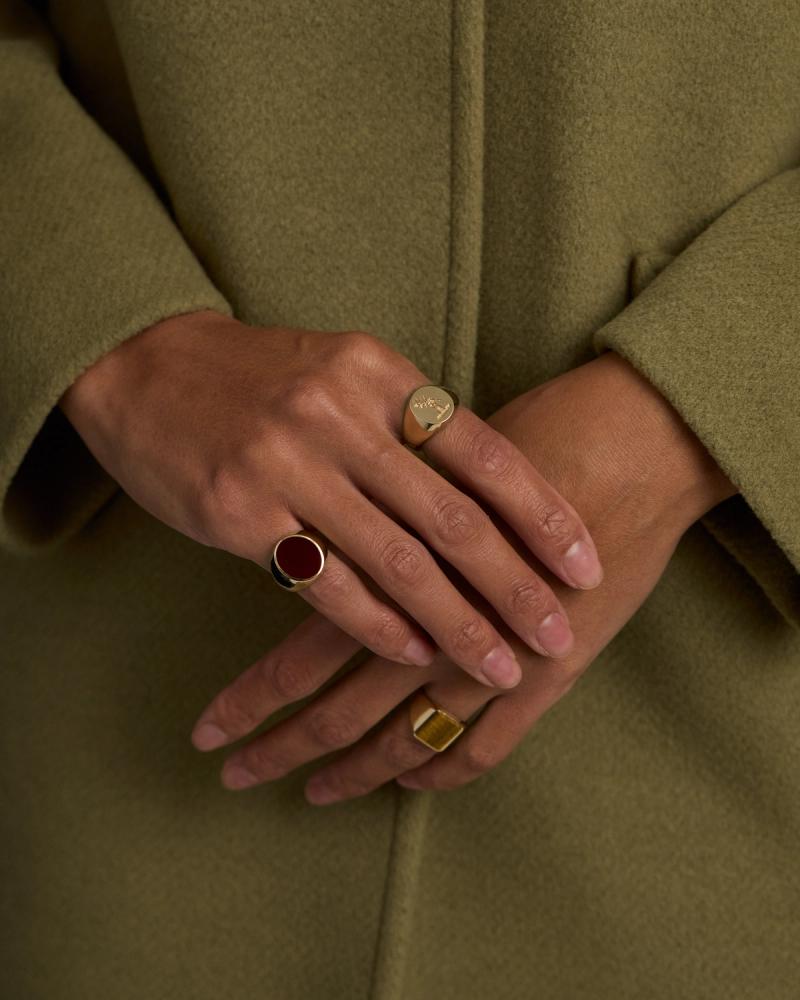
Our colour palette was drawn directly from the Ruffbird’s own tones - rich, grounded, assured - and from the softer, beautifully understated palette of its female pair, the Reeve bird. Strength and subtlety in balance. Masculine and feminine not as opposites, but as companions. These natural harmonies became the foundation of the brand -nothing imposed, everything inherited.
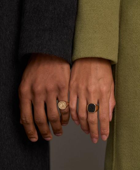
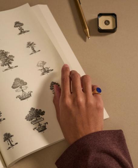
As the brand took shape on the page, we began asking how it should live visually. What should Ruffs look like when no one is explaining it? The answer lay not in trends or spectacle, but in quiet confidence. The jewellery we selected for the shoot was chosen not to shout, but to belong. Pieces with weight. Pieces that feel worn-in rather than styled on. Rings that carry a sense of time - as if they’ve always existed, simply waiting to be found.
The people we chose to work with mattered just as much. Our models were selected for their presence - individuals who felt grounded, expressive, and entirely themselves. We wanted collaborators who could hold stillness. Who could carry emotion without performance. In the same way our jewellery is made for living in, not displaying, the images needed to feel inhabited - real, human, and quietly assured.
Our designer, Barns Furr, reflected these values instinctively. He understood our family nuance; when to step back, when to simplify, when to let something speak on its own. Over the course of a year-long collaboration, there was a shared respect for craft - not just ours, but his. The work was guided by trust rather than instruction, by feeling as much as form.
Throughout it all, our father remained our compass. His stories - of benches, tools, and generations before us - grounded every decision. My sister brought clarity and sensitivity, always asking how something felt, not just how it looked. Together, we questioned, refined, and allowed the brand to emerge naturally - not imposed, but revealed.
What you see now is not a rebrand in the conventional sense. It is a distillation.
A clearer expression of what Ruffs has always stood for: considered craft, human connection, and beauty that doesn’t ask for attention - it earns it over time.
Because some things are not designed to follow fashion. They are made to endure.